A유형의 마지막 문제를 풀어볼 차례
A-4: 유진건설 와이어프레임 살펴보기

앞서 작업했던 다른 A형 문제에서 한 번씩은 출제되었던 구조가 조합되어 있다:
- 배경이 서브메뉴와 함께 슬라이드 되는 형태는 A-2와 동일
- 공지사항과 갤러리가 별도로 구성된 형태 또한 A-2와 동일하다
- 푸터 영역은 좌측의 로고 영역이 제외되는 대신 A-2에서 출제되었던 패밀리사이트 메뉴가 우측에 배치된다
- 이미지 슬라이드의 경우 A-3와 동일한 페이드인&아웃 형태의 애니메이션을 구현해야 한다
A-4: 유진건설 와이어프레임 구성하기
기존과 동일하게 Visual Studio Code를 실행한 뒤, 아래와 같은 구조로 파일을 생성한다:

HTML을 사용해서 와이어프레임의 기본 구조를 만든다:
<!DOCTYPE html>
<html lang="ko">
<head>
    <meta charset="UTF-8">
    <meta name="viewport" content="width=device-width, initial-scale=1.0">
    <title>유진건설</title>

    <!-- css -->
    <link rel="stylesheet" href="/A4/css/style.css">

    <!-- script -->
    <script src="/A4/script/script.js"></script>
</head>
<body>
    <div id="wrap">
        <header id="header">

        </header>
        <!-- header -->

        <article id="slider">

        </article>
        <!-- slider -->

        <main id="contents">

        </main>
        <!-- contents -->

        <footer id="footer">

        </footer>
        <!-- footer -->
    </div>
    <!-- wrap -->
</body>
</html>
이어서 CSS를 작성한다:
@charset "@UTF-8";

* {
    margin: 0;
    padding: 0;
    color: #333;
}

a {
    text-decoration: none;
    color: #333;
}

li {
    list-style: none;
}

img {
    vertical-align: top;
    width: 100%;
}

/* wrap */
#wrap {
    width: 1200px;
    height: 700px;
    margin: 0 auto;
}
/* header */
#header {
    width: 100%;
    height: 100px;
    background-color: #b0b0b0;
}
/* slider */
#slider {
    width: 100%;
    height: 300px;
    background-color: #a0a0a0;
}
/* contents */
#contents {
    width: 100%;
    height: 200px;
    background-color: #626262;
}
/* footer */
#footer {
    width: 100%;
    height: 100px;
    background-color: #5a5a5a;
}
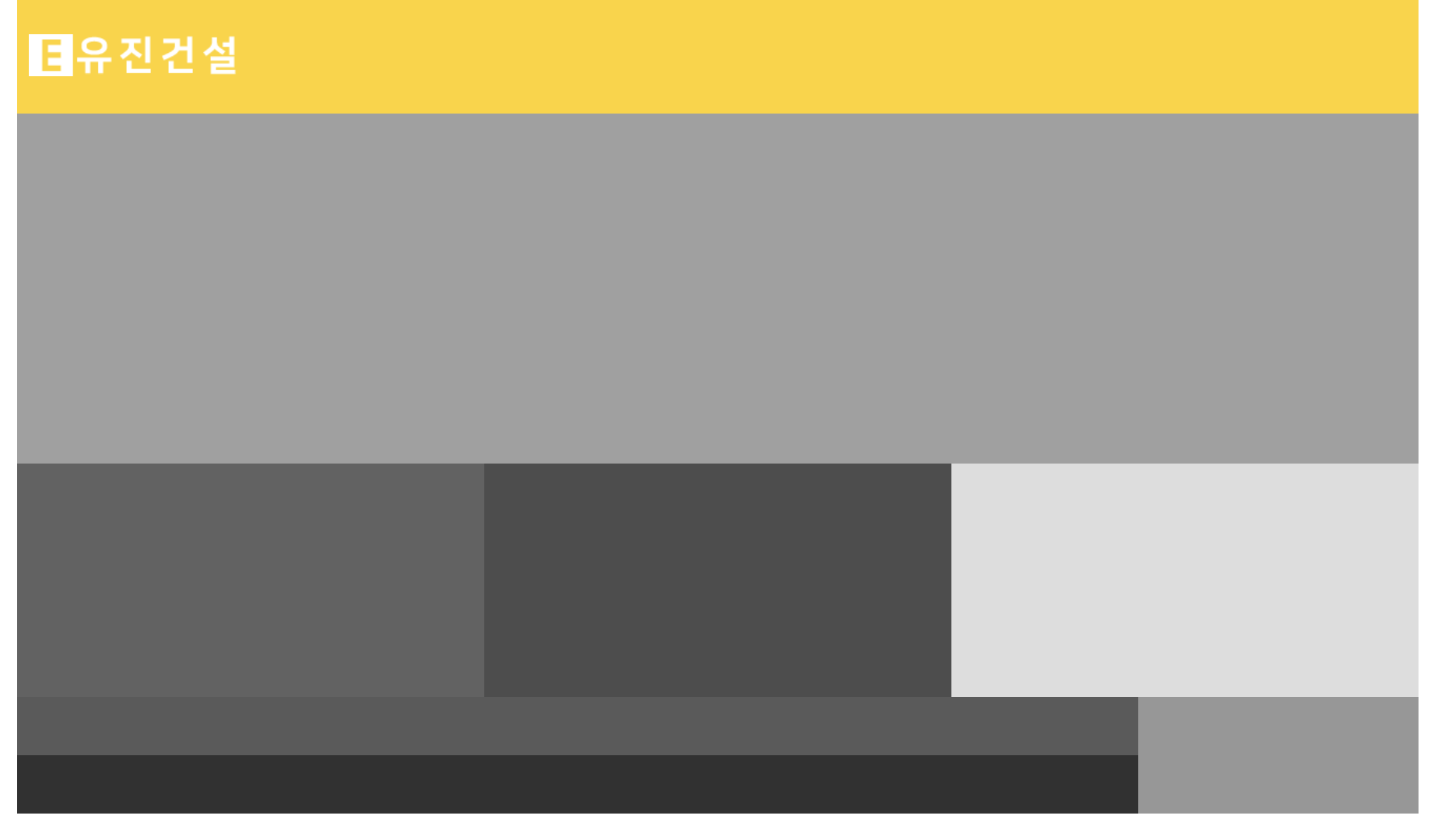
여기까지 작성하면 아래와 같이 기본 뼈대가 완성된다:

HTML과 CSS를 추가로 작성해서 와이퍼프레임 구조를 아래와 같이 완성한다:
HTML
<body>
    <div id="wrap">
        <header id="header">
            <h1 class="logo"></h1>
            <nav class="nav"></nav>
        </header>
        <!-- header -->

        <article id="slider">

        </article>
        <!-- slider -->

        <main id="contents">
            <section class="notice"></section>
            <section class="gallery"></section>
            <section class="link"></section>
        </main>
        <!-- contents -->

        <footer id="footer">
            <div class="footer1">
                <div class="footer1-1"></div>
                <div class="footer1-2"></div>
            </div>
            <div class="footer2"></div>
        </footer>
        <!-- footer -->
    </div>
    <!-- wrap -->
</body>
CSS
/* header */
#header {
    width: 100%;
    display: flex;
}
#header .logo {
    width: 200px;
    height: 100px;
    background-color: #b0b0b0;
}
#header .nav {
    width: 1000px;
    height: 100px;
    background-color: #d2d2d2;
}
/* slider */
#slider {
    width: 100%;
    height: 300px;
    background-color: #a0a0a0;
}

/* contents */
#contents {
    width: 100%;
    display: flex;
}
#contents .notice {
    width: 400px;
    height: 200px;
    background-color: #626262;
}
#contents .gallery {
    width: 400px;
    height: 200px;
    background-color: #4d4d4d;
}
#contents .link {
    width: 400px;
    height: 200px;
    background-color: #dddddd;
}

/* footer */
#footer {
    width: 100%;
    display: flex;
}
#footer .footer1 {
    width: 80%;
}
#footer .footer1 .footer1-1 {
    height: 50px;
    background-color: #5a5a5a;
}
#footer .footer1 .footer1-2 {
    height: 50px;
    background-color: #313131;
}
#footer .footer2 {
    width: 20%;
    background-color: #979797;
}
웹 브라우저 화면

A영역(헤더) 로고 코딩하기
포토샵을 이용해서 로고를 먼저 제작한다. 심벌 없는 워드타입으로 크기는 가로(200px) & 세로(40px)로 만들고 포맷은 PNG로 저장한다. A-4 유형은 푸터에 로고 영역이 따로 없기 때문에, 헤더용 로고만 제작한다.

HTML 코딩
 <header id="header">
            <h1 class="logo">
                <a href="#"><img src="/A4/images/logo.png" alt="유진건설 로고"></a>
            </h1>
            <nav class="nav"></nav>
        </header>
        <!-- header -->
CSS 코딩
/* header */
#header {
    width: 100%;
    display: flex;
    background-color: #ffd414
}
#header .logo {
    width: 200px;
    height: 100px;
}
#header .logo a {
    display: flex;
    justify-content: center;
    align-items: center;
    height: 100%;
}
#header .logo img {
    width: 90%;
}
브라우저 화면
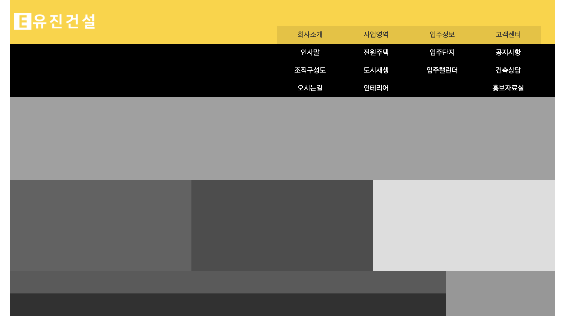
A영역(헤더) 메뉴 코딩하기
시험문제에 출제된 사이트맵을 참고하여 HTML 코딩을 진행한다:

HTML
<body>
    <div id="wrap">
        <header id="header">
            <h1 class="logo">
                <a href="#"><img src="/A4/images/logo.png" alt="유진건설 로고"></a>
            </h1>
            <nav class="nav">
                <ul>
                    <li><a href="#">회사소개</a>
                        <ul class="submenu">
                            <li><a href="#">인사말</a></li>
                            <li><a href="#">조직구성도</a></li>
                            <li><a href="#">오시는길</a></li>
                        </ul>
                    </li>
                    <li><a href="#">사업영역</a>
                        <ul class="submenu">
                            <li><a href="#">전원주택</a></li>
                            <li><a href="#">도시재생</a></li>
                            <li><a href="#">인테리어</a></li>
                        </ul>
                    </li>
                    <li><a href="#">입주정보</a>
                        <ul class="submenu">
                            <li><a href="#">입주단지</a></li>
                            <li><a href="#">입주캘린더</a></li>
                        </ul>
                    </li>
                    <li><a href="#">고객센터</a>
                        <ul class="submenu">
                            <li><a href="#">공지사항</a></li>
                            <li><a href="#">건축상담</a></li>
                            <li><a href="#">홍보자료실</a></li>
                        </ul>
                    </li>
                </ul>
            </nav>
        </header>
        <!-- header -->
CSS
먼저 아래와 같이 메인과 서브메뉴 구조를 정의해 준다:
/* header */
#header {
    width: 100%;
    display: flex;
    background-color: #ffd414
}
#header .logo {
    width: 200px;
    height: 100px;
}
#header .logo a {
    display: flex;
    justify-content: center;
    align-items: center;
    height: 100%;
}
#header .logo img {
    width: 90%;
}
#header .nav {
    width: 1000px;
    height: 100px;
}
#header .nav > ul {
    display: flex;
    justify-content: right;
    margin-top: 60px;
    margin-right: 30px;
}
#header .nav > ul > li {
    position: relative;
}
#header .nav > ul > li > a {
    display: inline-block;
    padding: 10px 45px;
    background-color: #e9c216;
}
#header .nav > ul > li > a:hover {
    background-color: #ae9317;
}
#header .nav > ul > li > ul {
    position: absolute;
    left: 0;
    top: 39px;
    width: 100%;
    text-align: center;
    background-color: #a58a11;
}
#header .nav > ul > li > ul > li > a {
    display: inline-block;
    padding: 10px;
    width: 100%;
    box-sizing: border-box;
    color: #fff;
}
#header .nav > ul > li > ul > li > a:hover {
    background-color: #d2bb55;
}
웹 브라우저 화면

그리고 그다음에 CSS를 이용해 서브메뉴와 함께 펼쳐지는 배경화면을 header 가상요소(#header::after)로 만들어주고, #header. nav에 z-index값 1000을 준다:
/* header */
#header {
    width: 100%;
    display: flex;
    background-color: #ffd414;
    position: relative;
}
#header::after {
    content: '';
    width: 100%;
    height: 117px;
    background-color: #000;
    position: absolute;
    left: 0;
    top: 100px;
    z-index: 1;
    transition: all 600ms;
}
#header .logo {
    width: 200px;
    height: 100px;
}
#header .logo a {
    display: flex;
    justify-content: center;
    align-items: center;
    height: 100%;
}
#header .logo img {
    width: 90%;
}
#header .nav {
    width: 1000px;
    height: 100px;
    z-index: 1000;
}
추가로 #header .nav > ul > li > ul에서 background-color를 제거한다:
#header .nav > ul > li > ul {
    position: absolute;
    left: 0;
    width: 100%;
    text-align: center;
}
여기까지 코딩하면 브라우저에 아래와 같은 화면이 나온다:
추후 자바스크립트로 메뉴를 제어할 수 있도록 아래와 같이 CSS코드를 수정한다:
}
#header::after {
    content: '';
    width: 100%;
    height: 0px;
    background-color: #000;
    position: absolute;
    left: 0;
    top: 100px;
    z-index: 1;
    transition: all 600ms;
}
#header.on::after{
    height: 117px;
}
그리고 아래의 CSS코드도 display:none 처리한다:
#header .nav > ul > li > ul {
    position: absolute;
    left: 0;
    width: 100%;
    text-align: center;
    display: none;
}
이렇게 코드를 최종 변경하면 추후 자바스크립트를 사용해 header 태그에 class = "on"을 추가하면 서브메뉴가 배경과 함께 나타나는 애니메이션 효과를 줄 수 있다.
여기까지 작업하면 웹 브라우저에 아래와 같은 화면이 표시된다:

B영역(슬라이드) 코딩
슬라이드 영역의 코딩을 진행한다. HTML과 CSS 코드는 기존의 다른 A유형과 동일하다:
HTML
  <article id="slider">
            <div class="sliderWrap">
                <div class="slider s1">
                    <a href="#"><img src="/A4/images/slider01.jpg" alt="모델하우스 VR 체험"></a>
                    <div class="text">
                        <h2>모델하우스 VR 체험</h2>
                    </div>
                </div>
                <div class="slider s2">
                    <a href="#"><img src="/A4/images/slider02.jpg" alt="건축과 인테리어"></a>
                    <div class="text">
                        <h2>건축과 인테리어</h2>
                    </div>
                </div>
                <div class="slider s3">
                    <a href="#"><img src="/A4/images/slider03.jpg" alt="유진건설 인재 채용"></a>
                    <div class="text">
                        <h2>유진건설 인재 채용</h2>
                    </div>
                </div>
            </div>
        </article>
        <!-- slider -->
CSS영역 코딩
/* slider */
#slider {
    width: 100%;
    height: 300px;
}
#slider .sliderWrap {}
#slider .sliderWrap .slider {
    position: relative;
}
#slider .sliderWrap .slider .text {
    position: absolute;
    left: 50%;
    top: 50%;
    transform: translate(-50%, -50%);
    text-align: center;
    background-color: rgba(0,0,0,0.4);
    padding: 20px 30px;
}
#slider .sliderWrap .slider .text h2 {
    color: #fff;
    font-size: 30px;
}
웹 브라우저 화면

추후 페이드인 & 아웃 애니메이션을 구현하기 위해 아래와 같이 CSS 코딩을 추가 작업하여, 모든 슬라이드 이미지를 같은 영역으로 모은다:
/* slider */
#slider {
    width: 100%;
    height: 300px;
}
#slider .sliderWrap {
    position: relative;
}
#slider .sliderWrap .slider {
    position: absolute;
    left: 0;
    top: 0;
}
웹 브라우저 화면

C영역 공지사항 코딩하기
먼저 아래와 같이 HTML을 작성한다:
<main id="contents">
            <section class="notice">
                <h3>공지사항</h3>
                <ul>
                    <li><a href="#">상반기 신입/경력 사원 채용 공고</a><span>2020.11.20</span></li>
                    <li><a href="#">건설의 날 기념 행사를 안내해드립니다</a><span>2020.11.20</span></li>
                    <li><a href="#">대학생 대상 건설현장 탐방기</a><span>2020.11.20</span></li>
                    <li><a href="#">유진건설, 시공편가 순위 상위 5위 달성</a><span>2020.11.20</span></li>
                </ul>
            </section>
CSS 코드
/* contents: notice*/
#contents .notice {
    width: 400px;
    height: 200px;
    background-color: #f5df7a;
    padding: 20px;
    box-sizing: border-box;
}
#contents .notice h3 {
    font-size: 24px;
    margin-bottom: 10px;
}
#contents .notice ul li {
    display: flex;
}
#contents .notice ul li a {
    width: 75%;
    font-size: 16px;
    line-height: 1.8;
}
#contents .notice ul li a:hover {
    text-decoration: underline;
}
#contents .notice ul li span {
    width: 25%;
    font-size: 16px;
    line-height: 1.8;
    text-align: right;
}
웹 브라우저 화면

C영역 갤러리 코딩하기
HTML
<section class="gallery">
                <h3>갤러리</h3>
                <ul>
                    <li><a href="#"><img src="/A4/images/gallery01.jpg" alt="갤러리1"></a></li>
                    <li><a href="#"><img src="/A4/images/gallery02.jpg" alt="갤러리2"></a></li>
                    <li><a href="#"><img src="/A4/images/gallery03.jpg" alt="갤러리3"></a></li>
                </ul>
            </section>
            <!-- gallery -->
CSS
/* contents : gallery */
#contents .gallery {
    width: 400px;
    height: 200px;
    background-color: #fff9d6;
    padding: 20px;
    box-sizing: border-box;
}
#contents .gallery h3 {
    font-size: 24px;
    margin-bottom: 10px;
}
#contents .gallery ul {
    display: flex;
    justify-content: space-between;
}
#contents .gallery a {
    border: 4px solid transparent;
    display: block;
}
#contents .gallery a:hover {
    background-color: #ffdd00;
}
#contents .gallery img {
    width: 100px;
    height: 100px;
}
브라우저 화면

C영역 바로가기 코딩하기
HTML
<section class="link">
                <h3>건축상담 받기</h3>
                <a href="#">바로가기</a>
            </section>
            <!-- link -->
CSS
/* contents : link */
#contents .link {
    width: 400px;
    height: 200px;
    background-image: url(/A4/images/link.jpg);
    background-size: cover;
    padding: 20px;
    box-sizing: border-box;
    position: relative;
    text-align: center;
}
#contents .link h3 {
    font-size: 24px;
    margin-bottom: 30px;
}
#contents .link a {
    display: block;
    margin: 0 auto;
    width: 100px;
    height: 100px;
    background-color: #e9c216;
    border-radius: 50%;
    line-height: 100px;
    text-align: center;
    color: #fff;
}
#contents .link a:hover {
    background-color: rgba(0,0,0,0.4);
}
브라우저 화면

D영역(푸터) 코딩
HTML
<footer id="footer">
            <div class="footer1">
                <div class="footer1-1">
                    <ul>
                        <li><a href="#">하단메뉴1</a></li>
                        <li><a href="#">하단메뉴2</a></li>
                        <li><a href="#">하단메뉴3</a></li>
                    </ul>
                </div>
                <div class="footer1-2">
                    COPYRIGHTⓒ by WEBDESIGN. ALL RIGHTS RESERVED
                </div>
            </div>
            <div class="footer2">
               <select>
                    <option>패밀리사이트</option>
                    <option value="1">패밀리사이트1</option>
                    <option value="2">패밀리사이트2</option>
                    <option value="3">패밀리사이트3</option>
               </select>
            </div>
        </footer>
        <!-- footer -->
CSS
/* footer */
#footer {
    width: 100%;
    display: flex;
    background-color: #d6d6d6;
}
#footer .footer1 {
    width: 80%;
}
#footer .footer1 .footer1-1 {
    height: 50px;
}
#footer .footer1 .footer1-1 ul {
    display: flex;
    justify-content: center;
    align-items: center;
    height: 100%;
}
#footer .footer1 .footer1-1 ul li::after {
    content: "|";
}
#footer .footer1 .footer1-1 ul li:last-child::after {
    content: '';
}
#footer .footer1 .footer1-1 a {
    margin: 30px;
}
#footer .footer1 .footer1-2 {
    height: 50px;
    display: flex;
    justify-content: center;
    align-items: center;
}
#footer .footer2 {
    width: 20%;
    display: flex;
    justify-content: center;
    align-items: center;
}
#footer .footer2 select {
    height: 30px;
    width: 80%;
}
웹 브라우저 화면

레이어 팝업 코딩
이제 마지막으로 레이어 팝업을 코딩한다.
HTML
   <div class="popup-view">
            <h2>상반기 신입/경력 사원 채용 공고</h2>
            <p>
                국내 최고의 건설회사로 발돋움하고 있는 유진건설에서는
                열정을 가지고 진취적으로 도전하는 신입/경력 사원을 모집합니다.
                남율건설과 함께 하실 역량있는 인재들의 많은 지원을 기다립니다.
            </p>
            <a href="#" class="popup-close">닫기</a>
        </div>
        <!-- popup -->
CSS
/* popup */
.popup-view {
    position: absolute;
    left: 50%;
    top: 50%;
    transform: translate(-50% ,-50%);
    width: 300px;
    height: 300px;
    background-color: #faeeb6;
    border: 4px solid #ffdd00;
    padding: 20px;
}
.popup-view h2 {
    font-size: 20px;
    margin-bottom: 15px;
    border-bottom: 2px solid #ffdd00;
    padding-bottom: 10px;
}
.popup-close {
    position: absolute;
    left: 50%;
    bottom: 20px;
    transform: translate(-50%);
    background-color: #ffdd00;
    padding: 8px 20px;
}
웹브라우저 화면

여기까지 작업하면 HTML과 CSS 코딩 파트는 모두 끝난다. 크롬 플러그인 Web Developer를 이용해서 W3C 유효성 검사를 진행하고, 이상이 없으면 자바스크립트로 넘어간다.
자바스크립트(Javascript) 코딩
A영역 메뉴 코딩
먼저 상단 메뉴 애니메이션을 작업한다. A-2와 동일하게 마우스를 메뉴에 호버 하면 전체배경이 함께 내려오는 형태로 구현한다.
Javascript:
window.onload = function(){
    let navList = document.querySelector(".nav > ul");

    // 자바스크립트용 CSS 구현
    let submenus = document.querySelectorAll(".nav > ul > li > ul");

    submenus.forEach(function (submenu){
        submenu.style.display = "block";
        submenu.style.height = "0";
        submenu.style.overflow = "hidden";
        submenu.style.transition = "all 600ms";
    });

    // 마우스 오버 시 전체 배경 나오는 애니메이션
    navList.addEventListener("mouseover",() => {
        navList.querySelectorAll(".submenu").forEach(sub => {
            sub.style.height = "118px";
        });
        document.getElementById("header").classList.add("on");
    });

    navList.addEventListener("mouseout",() => {
        navList.querySelectorAll(".submenu").forEach(sub => {
            sub.style.height = "0px";
        });
        document.getElementById("header").classList.remove("on");
    });
}
B영역 슬라이드 코딩
A-3와 동일한 페이드인 & 아웃 효과를 자바스크립트 코드로 구현한다:
//슬라이드
    let currentIndex = 0; //현재 이미지
    const slider = document.querySelectorAll(".slider"); //모든 이미지를 변ㄴ수에 저장
    slider.forEach(img => img.style.opacity = "0"); //모든 이미지를 투명하게 처리
    slider[0].style.opacity = "1"; //첫번째 이미지만 보이게

    setInterval(()=> { // 3초에 한번씩 실행
        let nextIndex = (currentIndex +1) % slider.length // 1 2 0 1 2 무한반복

        slider[currentIndex].style.opacity = "0"; //첫번쨰 이미지 사라짐
        slider[nextIndex].style.opacity = "1"; //두번쨰 이미지 나타남
        slider.forEach(img => img.style.transition = "all 1s"); //이미지 애니메이션 추가

        currentIndex = nextIndex; //두번째 인덱스값을 현재 인덱스값에 저장
    },3000);
레이어 팝업 코딩
마지막으로 레이어 팝업을 코딩을 해준다. 공지사항의 첫 번째 메뉴를 클릭하면 팝업창이 활성화돼야 하므로 먼저 아래와 같이 HTML을 수정한다. 공지사항 최상단 li 태그에 popup-btn 클래스를 추가한다:
   <main id="contents">
            <section class="notice">
                <h3>공지사항</h3>
                <ul>
                    <li class="popup-btn"><a href="#">상반기 신입/경력 사원 채용 공고</a><span>2020.11.20</span></li>
                    <li><a href="#">건설의 날 기념 행사를 안내해드립니다</a><span>2020.11.20</span></li>
                    <li><a href="#">대학생 대상 건설현장 탐방기</a><span>2020.11.20</span></li>
                    <li><a href="#">유진건설, 시공편가 순위 상위 5위 달성</a><span>2020.11.20</span></li>
                </ul>
            </section>
            <!-- notice -->
이어서 자바스크립트 코드를 작성한다:
//레이어 팝업
    document.querySelector(".popup-btn").addEventListener("click",function(){
        document.querySelector(".popup-view").style.display = "block";
    });
    document.querySelector(".popup-close").addEventListener("click",function(){
        document.querySelector(".popup-view").style.display = "none";
    });
여기까지 작업하면 모든 코딩이 완료된다.
최종완성 코드 & 화면
최종 코드:
https://github.com/saejunahn/Craftsman-Web-Design/tree/main/A4
최종 화면:
'디자인 자격증 > 웹디자인기능사' 카테고리의 다른 글
| C-1 웹디자인기능사 실기시험 공개문제 풀이(자바스크립트) (1) | 2023.11.20 |
|---|---|
| B-1 웹디자인기능사 실기시험 공개문제 풀이(자바스크립트) (1) | 2023.11.20 |
| A-3 웹디자인기능사 실기시험 공개문제 풀이(자바스크립트) (1) | 2023.11.13 |
| A-2 웹디자인기능사 실기시험 공개문제 풀이(자바스크립트) (0) | 2023.11.11 |
| A-1 웹디자인기능사 실기시험 공개문제 풀이(자바스크립트) (0) | 2023.11.08 |